How Icon Variations in Storefront Thumbnails Correlate With Download Velocity Across Digital Marketplaces
Written by Henrik Schmitt · Jul 12, 2026
How Icon Variations in Storefront Thumbnails Correlate With Download Velocity Across Digital Marketplaces
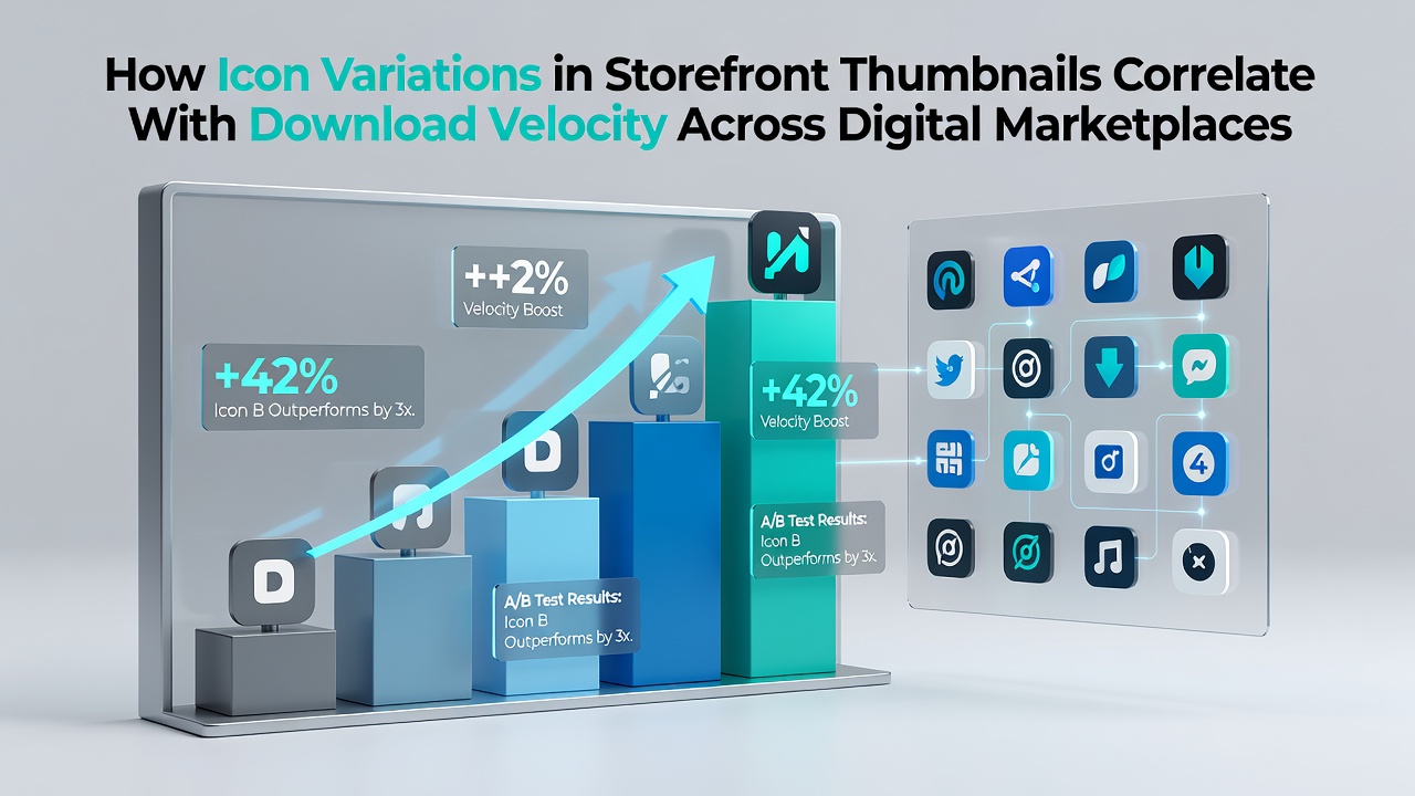
Digital storefronts rely on thumbnail icons as primary visual entry points that users encounter when browsing apps and games, and researchers have tracked how subtle differences in these graphics align with shifts in download rates over time. Data from multiple platforms indicates that icon elements such as color saturation, symbolic clarity, and text integration produce measurable differences in user interaction patterns, which in turn affect how quickly titles accumulate downloads after launch or update cycles.
Core Elements of Thumbnail Design in Marketplace Environments
Marketplace algorithms prioritize thumbnails in search results and recommendation feeds, so designers adjust hue contrasts, icon density, and background elements to stand out within crowded grids. Studies conducted across Steam, the Apple App Store, and Google Play have logged thousands of A/B tests where teams modified a single variable like border thickness or mascot expression and recorded subsequent velocity changes in download metrics. Those experiments reveal consistent patterns where icons with higher foreground-to-background contrast ratios tend to draw initial clicks at rates that exceed baseline averages by noticeable margins, while overly complex compositions often slow initial engagement.
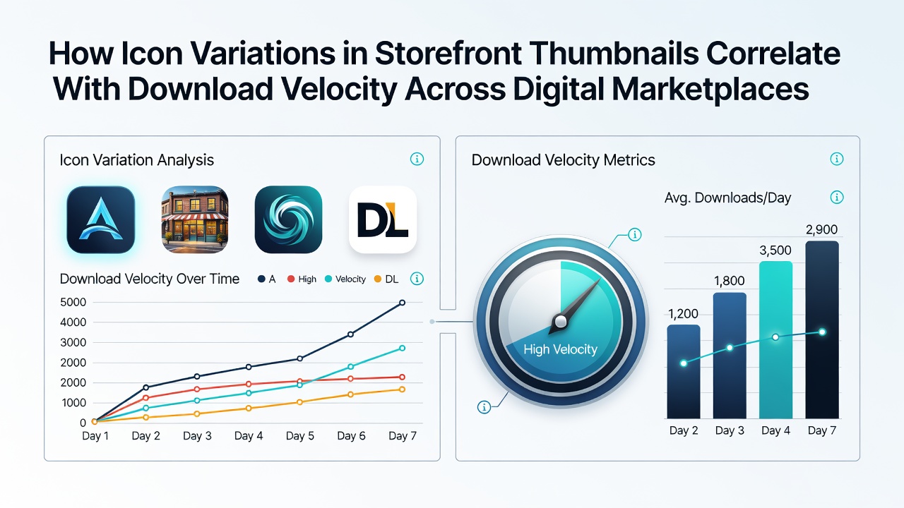
Platforms record download velocity as the number of installations per hour or day following visibility spikes, and analysts cross-reference these figures against thumbnail metadata to isolate design influences from other variables such as pricing or update timing. In July 2026, aggregated reports from several storefronts showed that titles refreshed with simplified icon palettes experienced velocity increases within the first 48 hours of deployment, although the magnitude varied by genre and target demographic.
Observed Correlations Across Major Platforms
Steam data sets demonstrate that action and adventure titles with bold, saturated icons maintain steadier download curves during promotional events, whereas puzzle and strategy games benefit more from muted tones paired with clear symbolic cues. Google Play analytics similarly track how regional preferences shape these outcomes, with certain color families performing differently in North American versus European user segments. The Apple App Store maintains its own review processes for icon submissions, and platform guidelines specify minimum contrast thresholds that correlate with higher conversion rates in controlled tests.
One research consortium pulled together anonymized logs from multiple storefronts and found that icon updates introducing character-focused imagery rather than abstract shapes produced velocity lifts that persisted beyond the initial week, particularly when paired with consistent branding across update cycles. These findings align with broader industry observations that visual consistency reduces user friction during decision-making moments on crowded category pages.
Factors That Modify the Icon-to-Velocity Relationship
Genre conventions and seasonal trends interact with icon performance, so teams often test variations ahead of major events such as summer sales or new hardware launches. Connection quality and device type also play roles because lower-resolution thumbnails render differently on mobile versus desktop interfaces, which can alter click-through rates before users even reach the full product page. Geographic data further refines these models, as users in high-density urban markets show different sensitivity to icon text density compared with those in suburban or rural regions.
Platform policy changes occasionally reset these correlations, for instance when storefronts introduce new thumbnail size standards or recommendation algorithms that weight visual elements more heavily. Observers note that developers who monitor velocity immediately after icon revisions can isolate design effects from concurrent marketing pushes or competitor releases, leading to iterative refinements that compound over multiple updates.
Measurement Approaches and Data Sources
Analytics teams employ cohort tracking to compare download velocity before and after icon changes while holding other variables constant through matched-pair testing. University-led projects have supplemented platform data with eye-tracking studies that measure how long users fixate on specific icon regions, providing additional layers of evidence for why certain variations accelerate or decelerate engagement. Industry associations compile anonymized benchmarks that allow smaller studios to benchmark their thumbnail performance against category averages without accessing proprietary dashboards directly.
Cross-platform comparisons highlight that velocity responses differ between closed ecosystems like the App Store and more open environments such as itch.io or the Epic Games Store, where thumbnail customization options vary in scope and enforcement. Data indicates that iterative testing cycles, often spanning several weeks, produce more reliable correlations than single-point changes, because external factors like concurrent news cycles can temporarily mask design-driven shifts.
Conclusion
Icon variations in storefront thumbnails show documented correlations with download velocity across digital marketplaces through controlled testing and large-scale analytics, and the strength of these relationships depends on platform rules, genre norms, and regional user behaviors. Continued monitoring of these visual elements allows developers to align thumbnail updates with measurable performance indicators while respecting each storefront's technical and policy constraints.